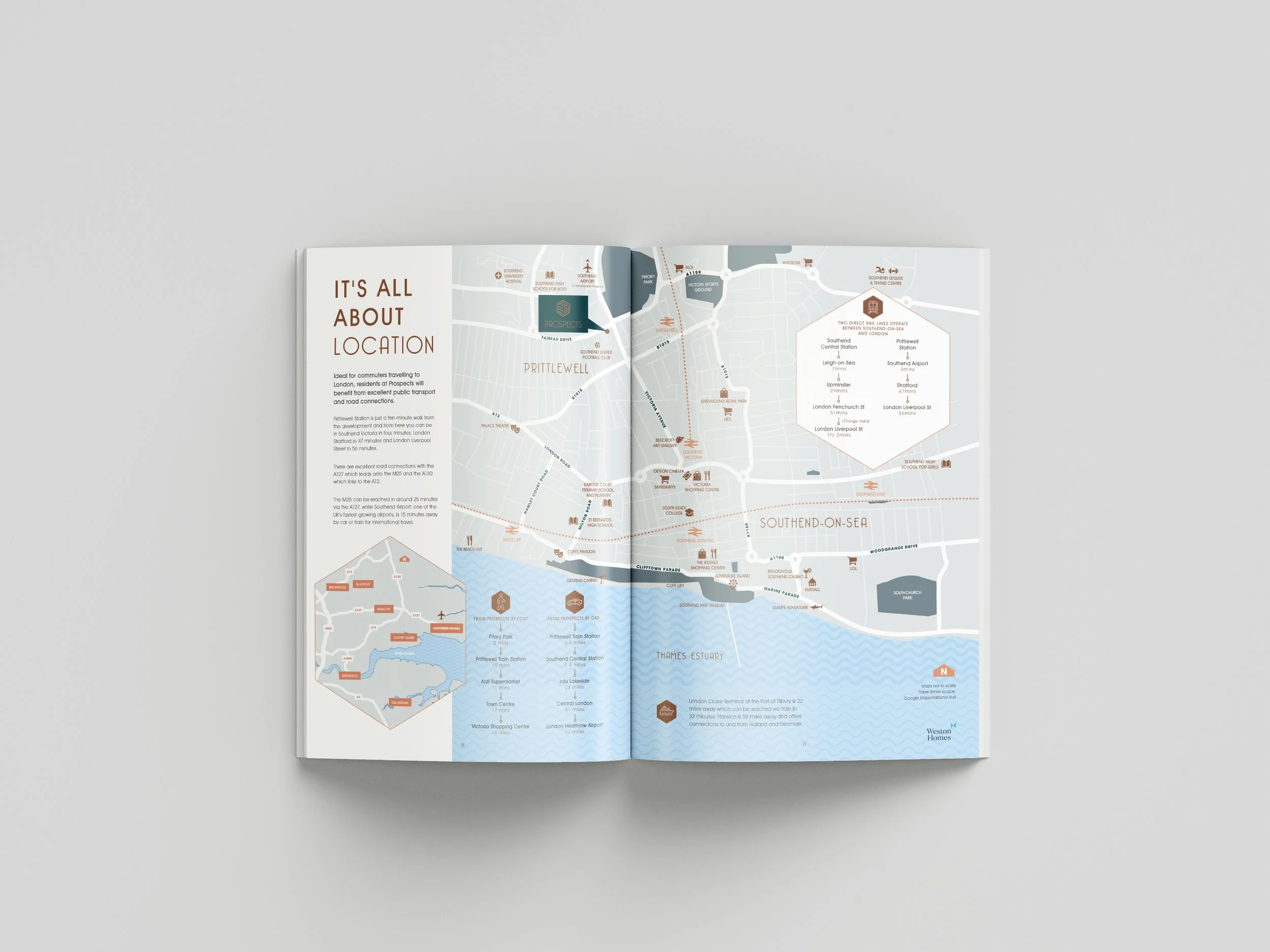
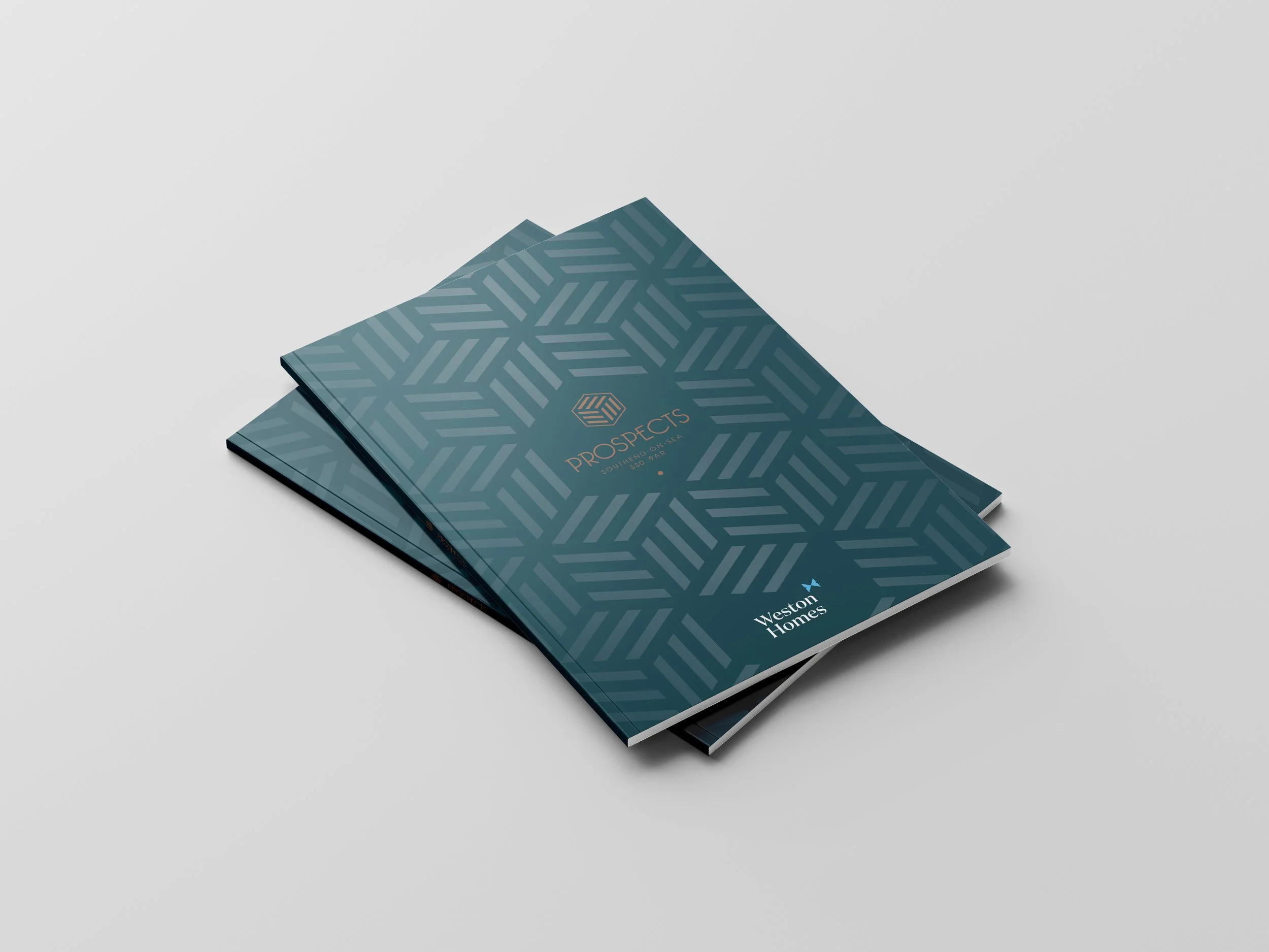
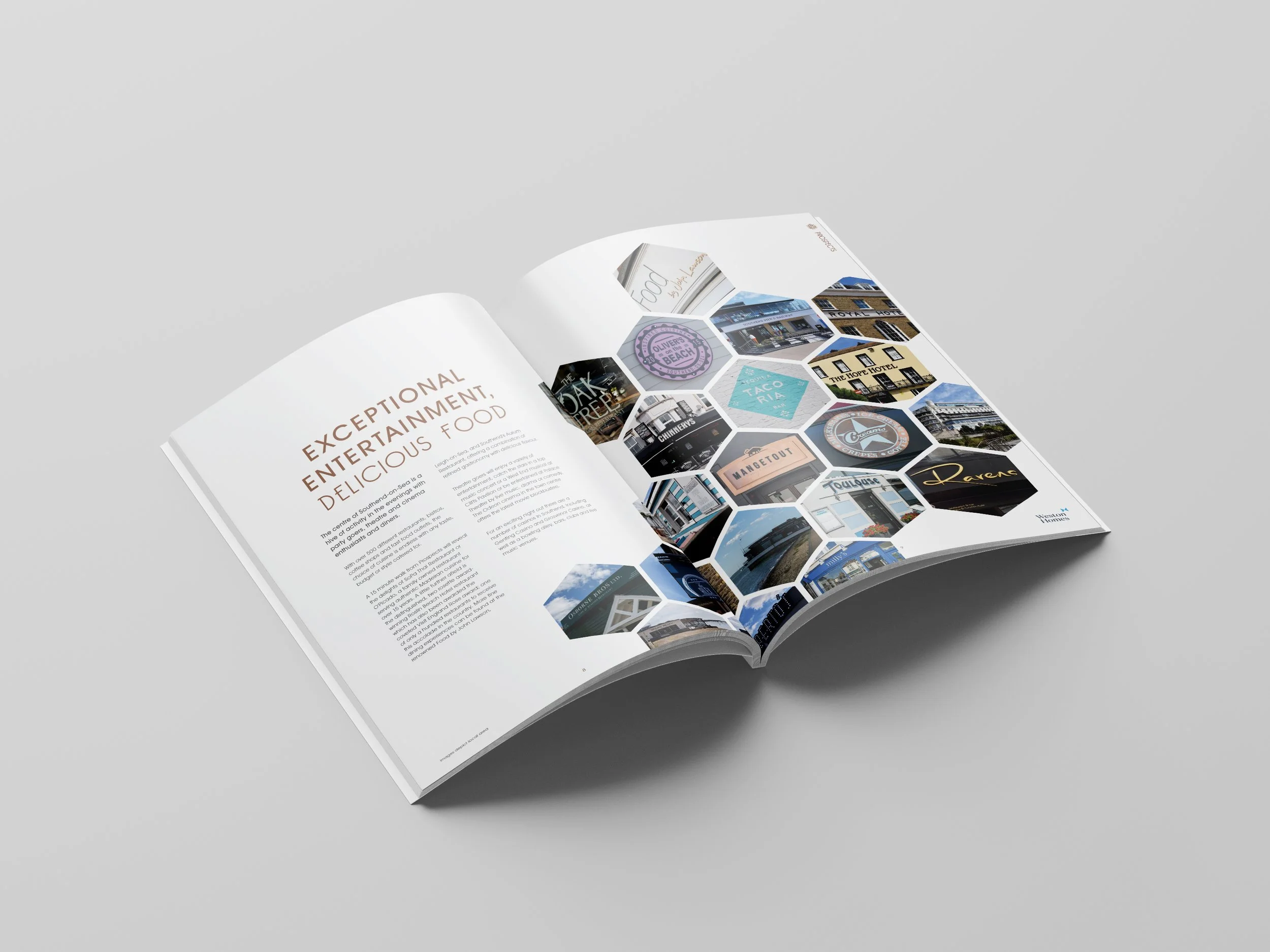
The brands icon was inspired by the development’s architecture; with large glazed windows, cube shaped blocks and angular forms. The hexagonal motif was used throughout the brochure to give the document a feeling of identity and cohesion. To give an element of richness, to mirror the high specification of the development, a deep green and copper colour palette were used. The brochure cover was foil blocked for an added touch of opulence.
